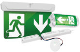
In this article the experts at ROBUS advise on how to best avoid a clash with your emergency signs.
Exit boxes are on the way out… and terrible lighting humour is still very much in!
Getting to grips with emergency lighting can challenge even the most experienced electrician, but being in the know will greatly reduce costs, save time and, most importantly, enhance safety.
A recent real-life scenario for a ROBUS Sales Manager involved a debate with a client’s fire safety consultant about exit signs. ROBUS installed a down arrow to lead people down a staircase, following the recommendations of its in-house lighting design team.
However, the consultant insisted on replacing it with a diagonal down arrow that was 12 times more expensive.
Why did this happen? In this case, the diagonal arrow was merely a suggestion in the regulations and not a requirement. This kind of mix-up happens quite often given the depth and breadth of guidance and regulations.
That’s why in this article, we will dive into emergency signs to clear up some of the confusion.
How to get started
Emergency signs fall under the umbrella of emergency escape lighting. The Electrician’s Guide to Emergency provides a procedure for identifying which areas require signage:
(a) carry out a risk assessment, to identify the hazards that will require emergency lighting, including high risk task areas;
(b) refer to the evacuation strategy prepared for the fire detection and alarm system.
Top tip: Ensure the evacuation strategy is up-to-date and practical. For example, during a ROBUS project in a social housing building, the engineer discovered that the evacuation route led residents to a closed courtyard, potentially trapping them. Outdated documents can also lead to dead ends, creating disasters during real emergencies.
After conducting your risk assessment, complete the following steps:
(c) position signs and luminaires at primary escape locations with direction signs if necessary, see Section 4.2;
(d) position luminaires to illuminate all points of emphasis and at additional locations;
(e) add luminaires as necessary to illuminate the escape routes;
(f) add luminaires as necessary to illuminate the open areas;
(g) illuminate high risk task areas, and
(h) position safety signs (see Figure 4.1).
As you can see, signs appear high in this procedure. This is not only because clear directions are critical for guiding people safely along an evacuation route. In most cases, the emergency signs will be luminaires, and if not, they will require illumination.
Therefore, it makes sense to start with emergency signs to know how many additional luminaries you will require to meet the necessary lux levels for each area.
By following these steps, you will minimise waste and avoid that all too common pitfall of installing more luminaires than required.

Where should emergency signs be installed?
Emergency signs should be installed where necessary to provide clear directions for building users. This includes:
• At exit doors
• Along escape routes
• At intersections in corridors
• Where there are stairs or escalators
• Where there are sudden changes in floor gradient, such as ramps
• In open areas (defined as rooms with a floor area greater than 60 m2) including large rooms and disability toilets
• On each floor of a building
• At safety equipment such as first aid locations, fire-fighting equipment, alarms, etc.
• At the nominated assembly area outside.
Viewing distances – height is important after all!
You’ll find viewing distances highlighted in the technical details of emergency signs. This is because the viewing distance for internally illuminated signs must be 200 x height of pictogram. If the sign isn’t combined with a luminaire but rather lit from an external emergency fitting, then the distance is reduced to 100 x height of pictogram.
On the REX EXIT BOX ROBUS fitting, the internally illuminated sign is 265 high. Multiplying that by 200 gives us 33,000 mm, or 33 m. This is the maximum distance from which the sign can be seen and legibly understood. If the fitting is installed at the end of a long corridor, you may need to either use a larger pictogram or install an additional sign further along the corridor.
The viewing angle is important because reading a sign straight on is easier than from the side. To calculate the viewing distance from an angle, multiply the distance by the cosine of the angle.
Experienced manufacturers like ROBUS can provide designs that incorporate these requirements.
Which way should the arrow go?
The most confusing direction is for ‘straight on’ – should it be a down arrow or up arrow?
According to the Industry Committee on Emergency Lighting, ‘straight on’ should be indicated by an upwards arrow. However, if the sign leads to a door followed by a descending staircase or ramp, the arrow should point downwards.
This isn’t set in stone, so consider potential misunderstandings in your design. A common-sense approach and absolute consistency are essential in any emergency lighting design.
Buy smart, think about lumens
How many luminaires do you need? The answer will depend on the necessary lux levels as much as providing clear directions.
It makes sense to check the lumens for the products you’re purchasing. You may find that buying one high-lumen luminaire is more cost-effective than multiple cheaper, low-lumen luminaires.
For more information on emergency lighting regulations and guidance refer to BS 5266-1, the British Standard for emergency lighting, and the Electrician’s Guide to Emergency.
Browse the ROBUS emergency range here
Find more technical articles here


